Basic post processing with GIMP in 5 simple steps
Basic post processing with GIMP in 5 simple steps
I don’t like to spend too much time with post processing photos. Prefer to make photos instead in interesting places. I like to do post processing quickly, and effectively. These are the main things I look at, the whole process can be done in a minute. This tutorial can be useful for somebody who does not post process pictures yet, for more experienced people can be very basic. This is how I do it. In each case it is very important to stop at a reasonable level of post processing otherwise the photo will look overprocessed/unnatural. To know this level I suggest experimenting. You make little level of change after more and compare what you like. It is important to be on top of the process meaning you know how you want your photo to look like. If you like the picture without post processing no need to make it worse, or spend the valuable time to change.
GIMP is a completely free software you can download and you can use afterwards without paying anything. The process can be done with many other software as well, the basics are usually the same. At the beginning the GIMP perhaps little awkward need to learn and get used to it, but it is a high level program. I used the 2.6 version for this tutorial. There are newer versions now with many changes.
1. Crop
2. Add contrast
3. Sharpening
4. Add saturation
5. Curves
1. Crop
In Gimp crop can be accessed in Tools-Transform tools-Crop or Shift+C to make it quicker
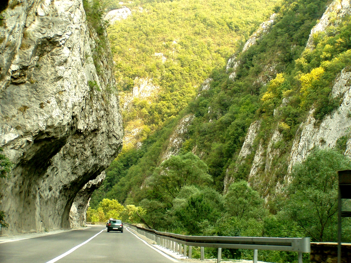
I try to make pictures that cropping is not needed afterwards but many cases it is needed. Fill the frame is the usual command but try to fill the frame with a Wren which is walnut-sized bird. Some cases disturbing things like cigarettes or garbage in the corners of the landscape picture or other things only visible on a computer. Light rays also can make interesting shapes or patterns which is not visible as much when we make the photo.
One tipical mistake is overcropping. If you crop too much you lose definition and can magnify noise levels. I mostly crop in bird photographs, where usually hard to get as close as I want, and usually use high iso for high shutter speed. By experimenting you can develop a system how much you can crop to maintain quality.
Other thing with cropping in wide angle shots or landscapes you can make as many partly different images from a single photo as you want. You can check how you like better. In some cases portrait setting (higher than wide frame) works better.
2. Add/remove contrast
In Gimp after opening the image we go to Colors-Brightness Contrast and after only move the slider in a required amount.
The main reason a picture look flat or uninteresting in many cases not sharpness but lack of contrast. If the light levels are not ideal usually contrast is lower. I usually add some contrast in camera as well depending on lenses. Better prime lenses give much better contrast usually. The level of contrast added is personal preference, and can be different to different pictures.
Below this is the original image as it comes out of a 3.2 MP Olympus compact camera.

Contrast +20

Contrast +40

Contrast +60
In this case I like strong contrast, but the last one is too much for my taste. The photo definitely better than before I think, but not as sharp as I like to.
3. Sharpening
In Gimp sharpening can be found in Filters-Enhance-Sharpening or Filters Enhance-Unsharp mask.
There are two types of sharpening the normal one and the unsharp mask. The unsharp mask add contrast as well, but makes halos around the edges, it is better to save an otherwise very un sharp but somehow interesting photo.
Most cases I use the normal sharpening which usually don’t give halos around the edges but not enhance contrast, just makes the picture looks more detailed.
If we want less detail in some cases we can use blur or Gaussian blur.
I get the +40 contrast photo and add +20 sharpening. Sharpening in Gimp is in Menu Filter-Enhance-sharpen

Basic sharpening does what it means, makes the image looking sharper, more crisp, showing more detail.
4. Add/remove saturation
In Gimp add saturation can be possible in menu Colors-Hue saturation by simply moving a slider. If we add contrast usually boost saturation as well. To desaturate the photo to make it black and white it is possible in Menu Colors-Desaturate, there are three different methods you can choose which you prefer. (lightness, Luminosity, and average )
Not always needed but can add to the photo quality.
In some cases you may remove some saturation or make the photo black and white by desaturating.
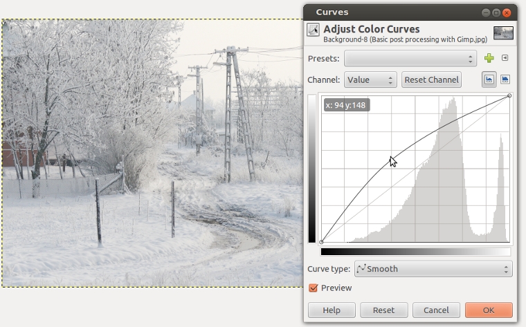
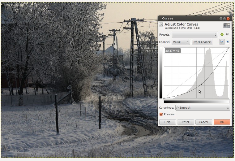
5. Curves
In Gimp curves can be found in menu Colors-Curves
In Gimp or Photoshop or Lightroom there is a function called curves. What is it ? It is used to make a photo, or parts of the photo lighter or darker. In case of bird photography many cases I try to underexpose the bird, to have more contrast and get rid of unwanted reflections or burnt-out details. In post processing I make the photo lighter as in reality. With burnt-out details there is nothing to do, the detail is lost.

In this photo the snow is not white but grey, I want it to be lighter, for this I grab this curve and move upwards, if i want to be darker I pull downwards, usually minor changes are better.
If we make the photo darker, it is an interesting opportunity to make low light looking darker images, which can add a special feel or flavor to the photo.
There is a curve which represent the photo. At the horizontal line there is a different light pixels. Left the black ones, middle tones at middle, whites and highlights at right. If we grab the curve and pulling upwards, the photo will be lighter, if we pull downwards it will be darker. We can grab the curve at different points, if we grab left side we can make even the dark parts of the photo lighter, if we grab at right side we can modify the bright parts as well. We can grab multiple points as well but this makes the process more complicated.
If the photo looks good regarding brightness this process can be skipped.
Most usual problem is overexposed photos(too light), which lacks definition. This case the curve function helps very much. Let’s see a tipical example.
Printing
If you print your photos must be careful with post processing because some artifacts (made by sharpening for example) much more visible on print than on the computer. For printing high resolution good quality base image required. Some printers for example Canons are make post processing before printing automatically (darkening the picture) so here need some practice to get the result you want.