Free HDR program qtpfsgui review tutorial
Free HDR program qtpfsgui
If you in photography for a while perhaps you think it would be interesting to make some HDR images. In Flickr for example it is very easy to stumble in some HDR images. Perhaps you wonder how these images were created ?
Qtpsfgui name
The program runs under two names: Qtpfsgui or Luminance HDR.
Qtpsfgui availability
The program is an open source program (“use the force Luke”) made by Sourceforge.net and it is a completely free program. But if you happy with this program and want to support them feel free to donate them if you like. It is available in many operating systems including Linux, Mac or Windows.
To get it simply write in the browser download qtpfsgui or luminance hdr, after click. In Linux open a terminal (ctrl+alt+t) and write sudo apt-get install qtpfsgui.

Alternatives
The most serious alternative is Photomattix which considered the best in HDR imaging, and perhaps the oldest one in this area but this is not a free program, cost you significant amount of money, more so in long term.
Most cameras also have built in HDR functions, but it is not the same as with a software.
[do_widget Text]
First what HDR is ?
HDR is an abbreviation of high dynamic range. If you make a picture of a bright object you may notice that the foreground can be very dark, when you see the pic on the computer, not as you see with your own eyes. Or many time in your landscapes the sky can be washed out white not blue as you see.
The reason of this that the digital camera has a limited dynamic range, much less than our vision. The HDR image try to overcome this by combining more exposures.
What to do before start the program ?
First we need 3 images with -2 0 +2 EV (exposure value) or a Raw image correctly exposed from the same subject at the same time. In not bright situations the tripod is a must.
There are two ways to achieve this, the first is exposure compensation (usually there is a slider) the second is using bracketing function of your camera. You can make more images as well like 5 but I think better to have as little number as possible because sharpness can suffer (each images is slightly different even on a tripod).
For this I used Nikon Dslr camera NEF or jpg files. If you don’t understand the first sentence you make three images: one correctly exposed, one heavily dark of the same subject, and one very bright. The program uses the best image for each part of the new combined image.
Qtpfsgui tutorial
|
Steps to follow: 1. Open images (put all images for the HDR in the same map, must open all images in one step) 2. Adjust exposure values (put -2 0 2 for each image) 3. Auto align images by clicking in the checkbox 4. Click next and finish buttons 5. Tone mapping 6. Adjust curves (optional) 7. Save the end result. |
It may seem very complicated but several minutes you can finish your first HDR photo.
The process in detail
First you must put your three images in a folder with -2 0 +2 exposures, or a NEF file. There are 2 menus, one at the top of the page (File, Image, View, Tools, Helps) and one below with bigger letters/icons (New HDR, Open HDR, Save HDR as, Tonemap the HDR, EXIT).
First choose New HDR from the lower menu, you will see a new window push the button load images at the left upper part, select the folder and the images using shift key for multiple selection then press enter. Select all images at once, this is why important to not have any other images in the folder.
Normally the program shows the exposure values in a dialog in the right part of the window. In my case shows values like -5.72 -7.86 -9.92 EV. Some tone mapping operator accepts that but others not, so must change this values to -2 0 and +2EV in the right box. In the left side of the window you can see a list of your chosen photos, when click on them normally the exposure value is changing in the right box.
If you have more photos check the box Auto align images and click next. You need to wait several seconds or minutes depend on your computer’s speed.
[do_widget Text]
In the new Editing tools screen you can modify the arrangement of the 3images compare to each other using the arrow key buttons on this new screen. In Preview mode choose overlay first, to see if it is good or not, and if you see halos, you can click on the arrow keys which moves the given image by pixel. Usually the program does correctly no need to change, than push next, and on the next window finish.
Now your HDR images is created in EXR format. To see properly you can choose fit to window in the upper menu view tab.
Now tonemapping is coming, this HDR image is something like a Raw file, not really used other than for a template. By saving it you can spare the activities made before and start with tonemapping.
For tonemapping must choose an operator from a drop-down menu, but before push the button in the upper-below menu Tonemap HDR. After you can start playing with the different parameters see below. All operators are different.
Some notes
Not all pictures works as you think. My first pic was a sunset from a balcony, the program simply cannot align the images. Don’t be discouraged if something doesn’t work at first, it is a great program. Perhaps you think it is not good for anything, check the more than 10,000 happy users in Flickr. Don’t expect to win HDR competition tomorrow though. I need a day to make some images which I liked, you don’t need because I share my experiences in detail.
Tone mapping operators
Each tone mapping operators gives different looking results and many cases uses completely different parameters and algorithms. To see differences I include the same picture with default setting at each. The best results are different for different pictures, you won’t get the best results by default settings. Experimenting is the key word here.
There are basically two approaches:
1. Naturally looking results. Perhaps an average user doesn’t recognize it is a HDR. Someone who
experienced in photography can recognise the difference.
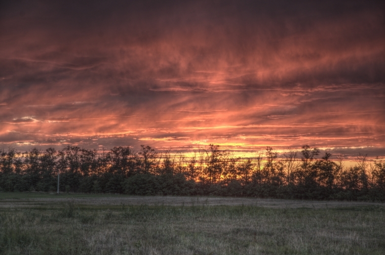
2. Dramatic looking results often over-saturated colors, dark sky, enhanced contrast etc.
Can be something in betweeen, and each operators has an ability to change settings to give different output.
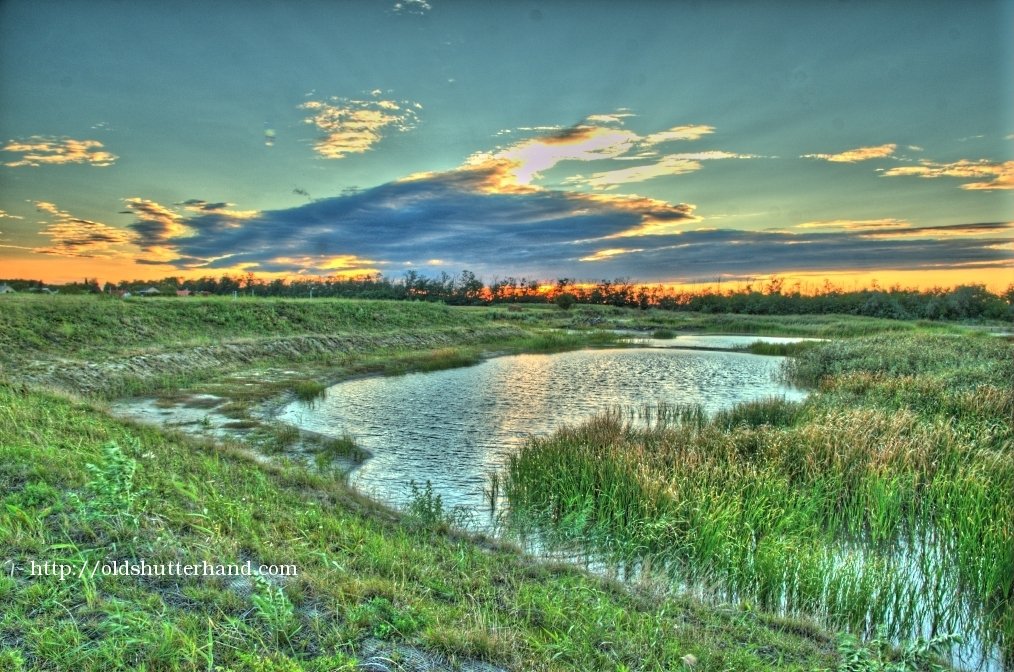
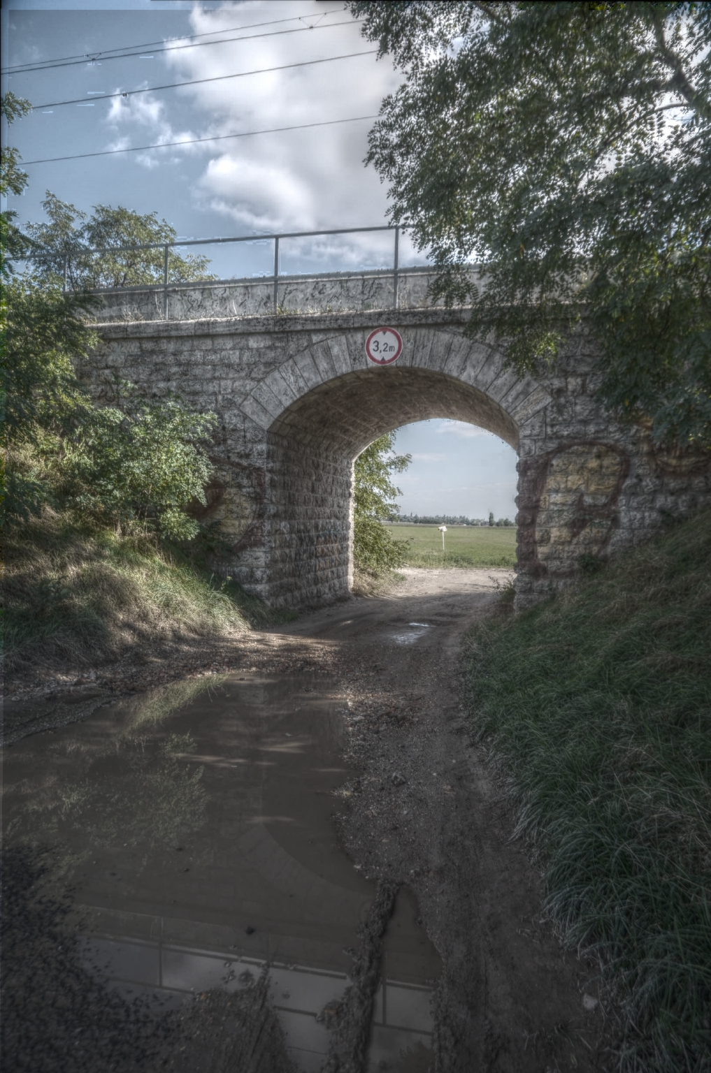
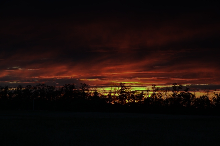
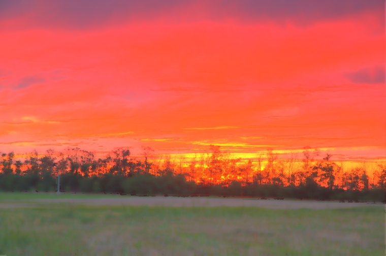
When I first though about HDR I want dramatic results, darker sky, or lighter shadow areas, like the pic at the top of the page. Black and white also possible.
Manthiuk
 Even the default values give interesting results.
There are 3 values to adjust: contrast, saturation and detail factors. Preset values: 0,1 0,8 and 1.
The contrast can be adjusted between 0,001 and 10. It is not the most effective method to increase contrast, better to lower the pre-gamma value. In the higher values it is more increase detail by adding extra lines in every direction, like the detail factor.
Saturation does what it’s name suggests. The default value is 0.8.
The detail factor can be regulated between 1 and 99, for my taste the 1 and 2 usable. After the effect is similar to the results of the contrast factor.
Pictures with low saturation can be very interesting looking as well.
Fattal

This operator gives a dramatic picture which is often preferred. Darker sky and sharpened details. The automatic results for me is too agressive. It is one of the most interesting operator, partly because it gives dramatic results, partly because it is quite adjustable. What I originally search in a HDR program is to dramatize/darken the sky and lighten the dark foreground, and the fattal does both fairly well. In most cases the results not so realistic though. Fattal is not recommended for noisy images, because the noise is also exaggerated.
Parameters to adjust: Alpha, Beta, Color saturation and noise reduction. Default values: 0.1, 0.8, 1, 0 in the same order.
The overly agressive look can be bettered by lower Alpha and lower saturation values. Changing beta values can result extreme looking pics. Best values around 0.8 – 0.9 range. Smaller values give very unrealistic look, bigger values give dark results which is usual at other operators as well.
Drago
There is one parameter to adjust, they call Bias. It can be regulated between 0,5 and 1. The smaller numbers give lighter or lower contrast results, the bigger number give darker or more contrasty results. The default value is 0.85.
There is one another parameter but it is adjustable in all other operators called pre-gamma. Usually lower numbers give darker or more contrasty results, bigger number give lighter results. In some operators there is a small difference. The default value is 1.
Durand

The Durand operator also give more natural looking results. This can be the longest to calculate especially if we give big value in the first parameter.
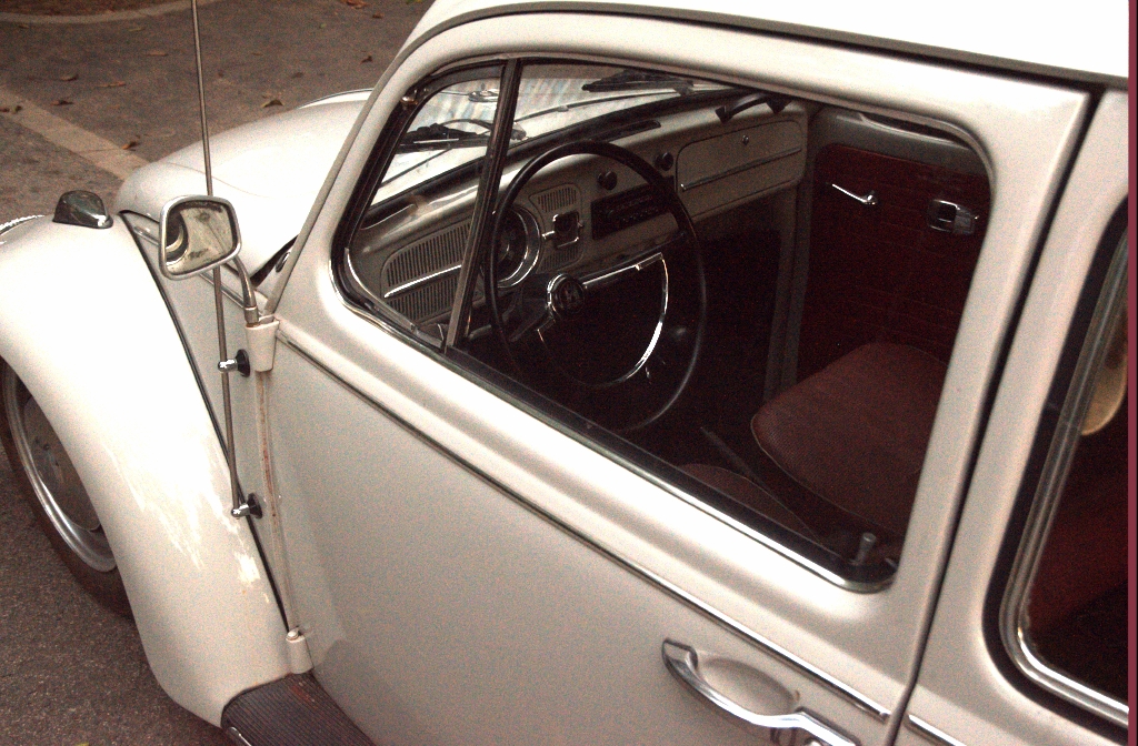
Durand works very well with noisy pictures as well, while Fattal and Ashikhmin gets terribly noisy. This car detail was pulled out of a single ISO 9000 NEF file..
Reinhard 02
It gives more natural looking results. Contrast is moderate but on this expense has better detail. Contrast is possible add later to the preserved detail.
Reinhard 05
The Reinhard 05 gives usually darker results than the Reinhard 02 for the same picture.
Ashikhmin
The end result can be high in contrast and very colorful but washed out as well.
Pattanaik
Pattanaik use Cone and Rod values. The default values are 0,5 for both, but small values for cone and big values for Rod works better. The sum must be 1 or near, other case saturation is lost.
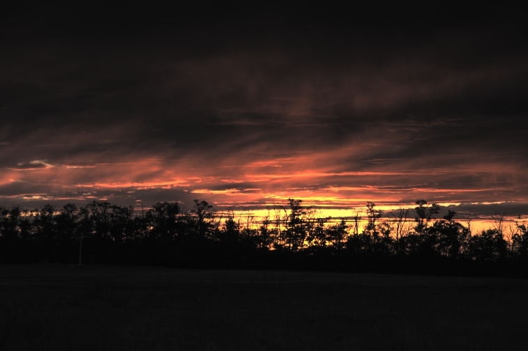
Perhaps you wonder how the original image look like ? Original image is usually sharper than the HDR version.
After tonemapping you can adjust levels, but it is also possible in a separate program afterwards, like Photoshop or Gimp.
Adjust levels
After tone mapping there is a possibility to adjust levels. The levels can be accessed from the top menu. There is a curve with 3 values: black, gamma and white. Here we can allow some blacks and whites on the picture (burnt out or simply black at the two end of the 255 degree scale). I usually allow some blacks for having better contrast / punch, and darken the image.
Finally we can save the image by save as. I note a small border(several pixels) is left usually on the right side of the end result jpg with reddish color, which I usually cut out of the image.
Other thing I noticed when I upload the first images on the website lots of information was automatically added like parameters under the image, which I don’t want, so I cure them with Gthumb software delete
Bottom line / recommendation
HDR is fun, you quickly can get hooked, it is like a macro lens. The Qtpfsgui is a nice program which can increase your creative potential highly. It is free, nothing to lose, highly recommended !